Lire votre tableau de bord
Comprendre les onglets Vue d'ensemble, Blog et Social, le widget d'utilisation, la carte d'intégration et où se trouvent les analyses sociales.
Mis à jour le Jul 9, 2026
Le tableau de bord est votre écran d'accueil, à l'adresse /tools/dashboard. C'est une vue informative : il montre les performances de votre contenu et la part de votre forfait que vous avez utilisée. Il n'y a pas de boutons de création ou de composition ici, et les seules actions sont le filtrage et l'exportation.
Les trois onglets
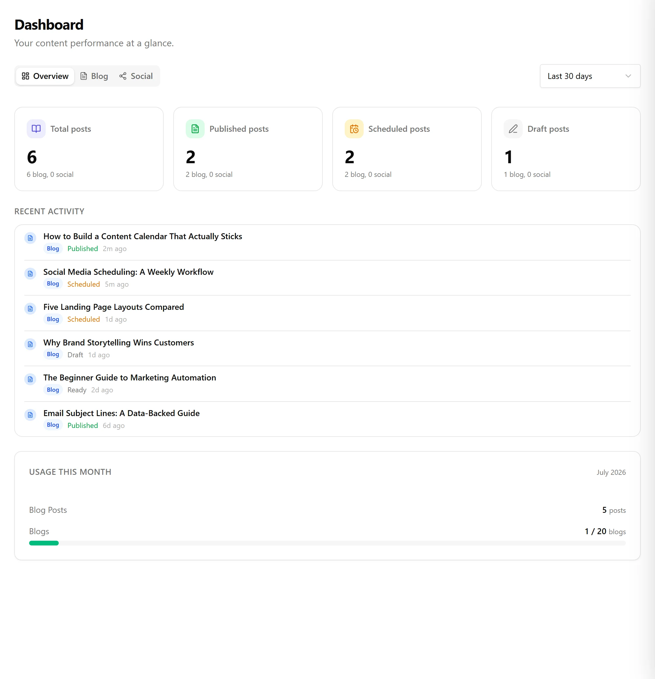
Une barre d'onglets en haut permet de basculer entre les vues. Un menu déroulant de période (7 derniers jours, 30 derniers jours, ce mois-ci ou depuis le début) s'applique à toutes.
- Vue d'ensemble est l'onglet par défaut. Il affiche quatre décomptes combinés (total des publications, publiées, planifiées et brouillon) ainsi qu'un flux d'activité récente construit à partir de vos dernières publications. Les éléments du flux renvoient directement à l'éditeur.
- Blog se concentre sur le contenu de votre blog.
- Social n'apparaît que sur les forfaits dont les fonctionnalités sociales sont connectées.
Onglet Blog
L'onglet Blog affiche vos décomptes de publications pour la période sélectionnée :
- Total des publications, sous forme d'un grand chiffre cumulé
- Des badges de statut pour Brouillon, Prête (affiché lorsqu'il en existe), Planifiée et Publiée
- Une ligne nouvelles sur cette période lorsque vous avez créé des publications dans l'intervalle
Si votre organisation possède plusieurs blogs, un menu déroulant de filtre de blog vous permet de restreindre les chiffres à un seul blog. Sous les décomptes, un widget d'analyses WordPress liste vos publications les plus consultées par nombre de vues lorsqu'un site WordPress est connecté.
Onglet Social
C'est ici que se trouvent vos analyses sociales. Accéder à /tools/social/analytics vous redirige simplement ici, vers /tools/dashboard?tab=social.
Sélectionnez un canal connecté dans la barre latérale pour voir les graphiques par canal. Selon ce que la plateforme rapporte, les métriques incluent les impressions, les vues, les mentions J'aime, les commentaires, les abonnés et les partages, chacune affichée sous forme de courbe de tendance avec un total et un pourcentage de variation. Une option Télécharger le CSV exporte les métriques des canaux que vous sélectionnez. Si vous n'avez encore aucun canal connecté, l'onglet vous invite à en connecter un dans les paramètres.
Le widget d'utilisation
Pour les abonnés, un widget d'utilisation au bas du tableau de bord affiche la consommation du mois par rapport aux limites de votre forfait, avec des barres de progression qui passent à l'ambre au-delà de 70 pour cent et au rouge au-delà de 90 pour cent. Il suit :
- Les publications de blog créées ce mois-ci
- Les blogs utilisés
- Les images AI générées
- Les publications sociales créées
Les quotas illimités sont indiqués comme tels plutôt que d'afficher une barre. Le widget est masqué lorsque vous n'avez pas d'abonnement actif.
Intégration et essai
Tant que vous n'avez pas terminé la configuration, une carte d'intégration figure en haut du tableau de bord. Elle indique votre progression à travers les cinq étapes de configuration (bienvenue et site web, mots-clés, profil de voix, première publication et fin) avec un bouton Continuer la configuration qui rouvre l'assistant.
Si votre essai a pris fin sans abonnement, une bannière vous renvoie vers la page des forfaits. Juste après le démarrage d'un essai, le tableau de bord peut brièvement afficher un état de configuration pendant que votre abonnement est confirmé en arrière-plan.
Articles liés
Cet article vous a-t-il été utile ?
Besoin d'aide supplémentaire ?
Vous ne trouvez pas ce que vous cherchez ? Ouvrez votre portail de support pour le chat en direct et les tickets. Connectez-vous avec votre compte Nolorem.
Ouvrir le portail de support